A heavy stylized, synthetically distilled, post-modern, blablabla…
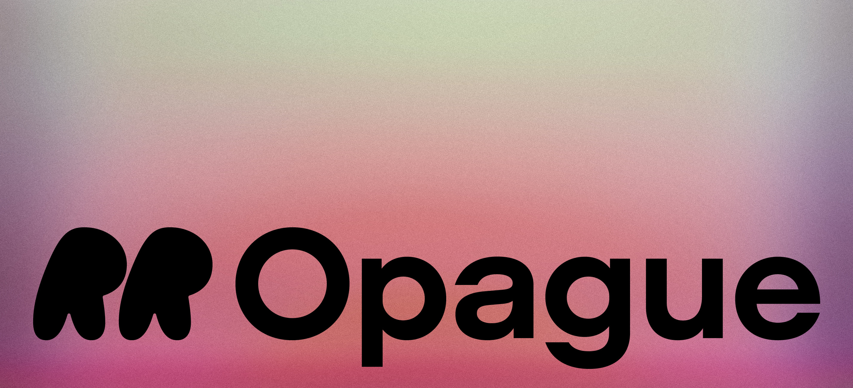
RR Opague family
by Rüdiger
single style from €90
|
family from €648
Brutalism
①→R⬎
↖G↤❷
↖G↤❷
abcdefghijklmnopqrstuvwxyz
ABCDEFGHIJKLMNOPQRSTUVW
fonts.XYZ
0123456789.:,;-—(|¦)&¥€$“?!”
ABCDEFGHIJKLMNOPQRSTUVW
fonts.XYZ
0123456789.:,;-—(|¦)&¥€$“?!”
RR Opague family
by Rüdiger
single style from €90
|
family from €648
359
RR Opague Thin!
●Кириллица ●Ελληνικά ●Latin
RR Opague Light Italic
“IDLES”
Trilatéral
VIPÉRIN
Brutal Cyrillic Support!
RR Opague family
by Rüdiger
single style from €90
|
family from €648
nº Б
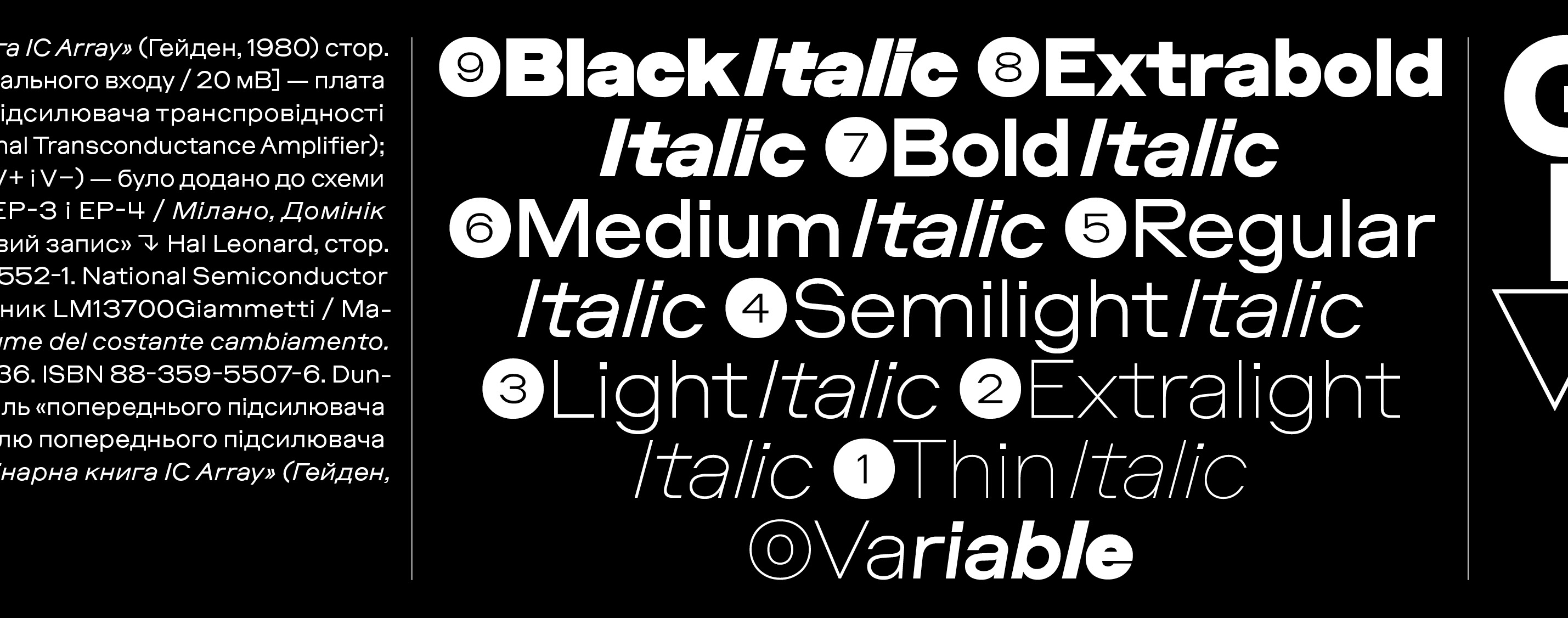
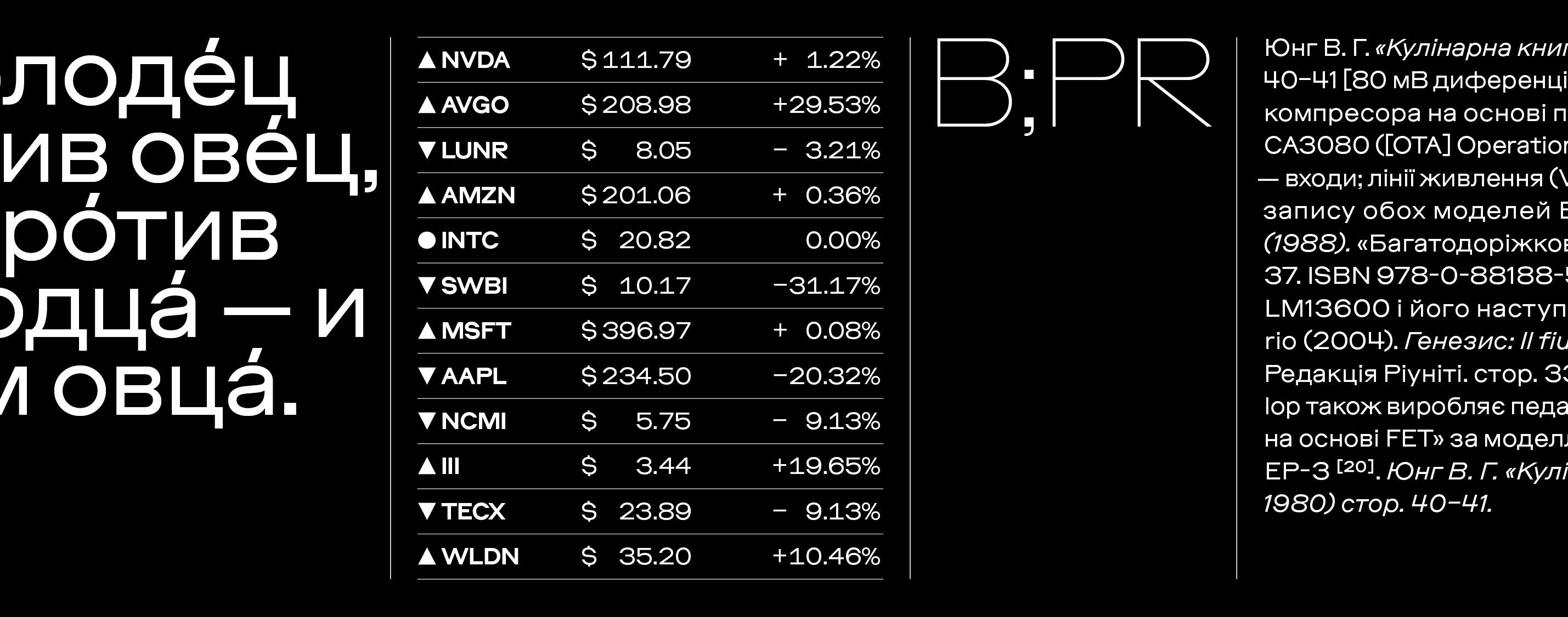
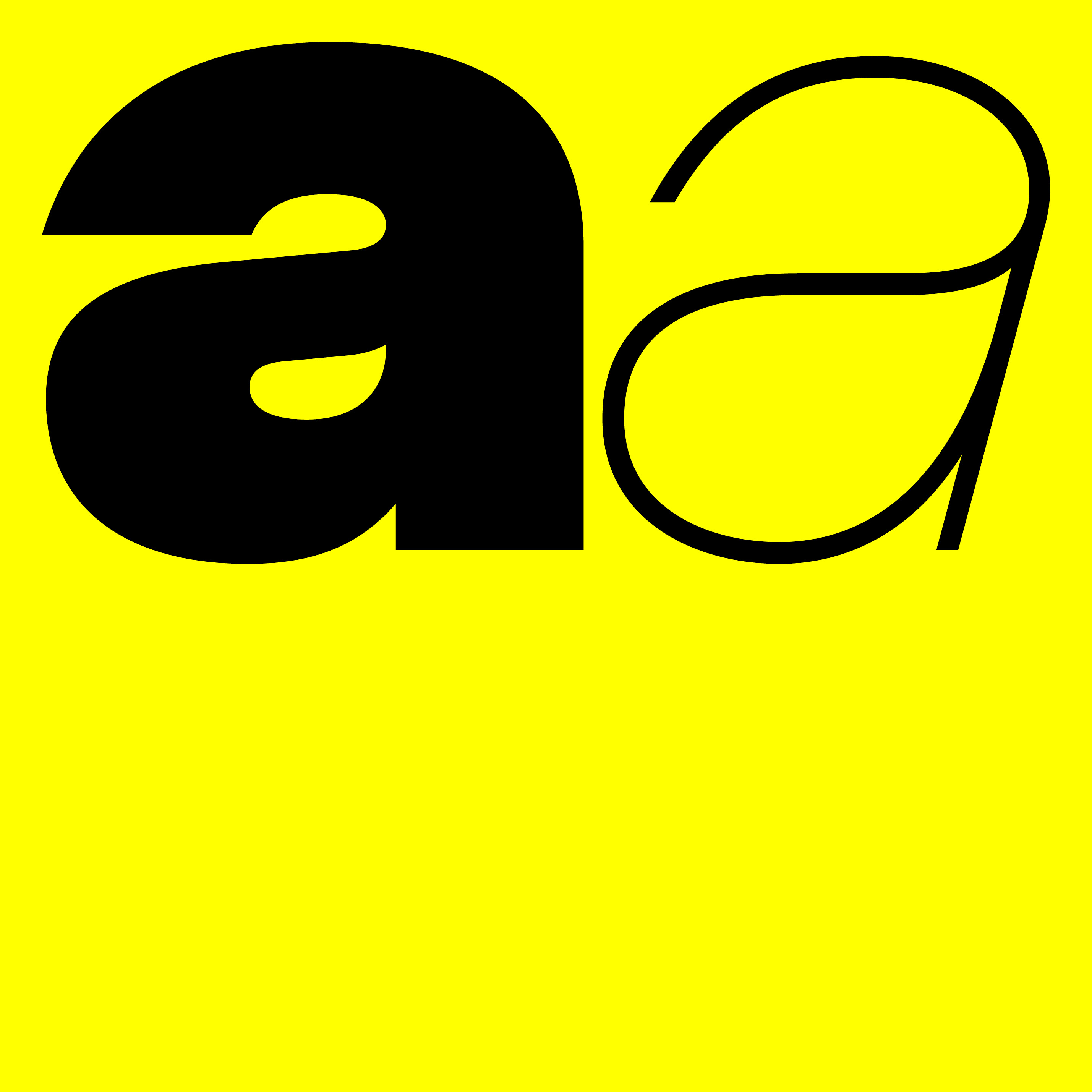
OPAGUE est une réinterprétation postmoderne de la typographie géométrique sans empattement. OPAGUE est une police de caractères géométrique sans empattement, méticuleusement conçue et distillée à son essence pure. Sa palette de couleurs atténuée et son élégance presque anonyme font d’OPAGUE un outil polyvalent idéal, gérant sans effort aussi bien les textes courants que les titres imposants, et tout ce qui se trouve entre les deux (et au-delà). La géométrie et les ouvertures d’OPAGUE s’inspirent à la fois du classique « Lining Gothic No. 82 » de Bernard, Brother & Spindler et d’un désir insatiable de simplicité brutale. À y regarder de plus près, OPAGUE dévoile un caractère unique, fortement influencé par ses « O » / « o » ostensiblement circulaires, qui reflètent le désir humain de symétrie tout en se soumettant aux lois froides des mathématiques. Cette précision mathématique est renforcée par ses lignes horizontales rigoureuses. Pourtant, derrière cette brutalité apparente, OPAGUE révèle une élégance ouverte et naturelle. Toutes ces caractéristiques techniques s'étendent sur neuf graisses, chacune accompagnée d’une italique à un angle modérément prononcé de 15°. Le format variable transforme cette collection de 18 styles en un véritable outil typographique offrant une flexibilité infinie entre poids et inclinaison.
OPAGUE — це постмодерністське переосмислення жанру геометричних безшрифтових гарнітур. OPAGUE — це ретельно розроблений геометричний безшрифтовий шрифт, синтетично очищений до своєї сутності. Його приглушена кольорова палітра та майже анонімна витонченість роблять OPAGUE ідеальним робочим інструментом — він бездоганно підходить як для суцільного тексту, так і для великих заголовків і всього, що між ними (та навіть більше). Геометрія та апертури OPAGUE натхненні як класичним «Lining Gothic No. 82» від Bernard, Brother & Spindler, так і ненаситним прагненням до брутальної простоти. При другому погляді OPAGUE розкриває свій унікальний характер, формований, зокрема, його майже ідеально круглими «O» / «o», що відображають людське прагнення до симетрії, але водночас підпорядковуються холодній математиці. Ця математична точність ще більше підкреслена жорсткими горизонтальними лініями. Проте прихована брутальність OPAGUE без зусиль компенсується його відкритою елегантністю. Усі ці технічні характеристики охоплюють дев’ять варіантів товщини, кожен із відповідним курсивом під нахилом 15°. Формат змінного шрифту розширює цей набір із 18 стилів, перетворюючи його на ще більш універсальний інструмент, що відкриває необмежені можливості поза межами статичних стилів.
A—A
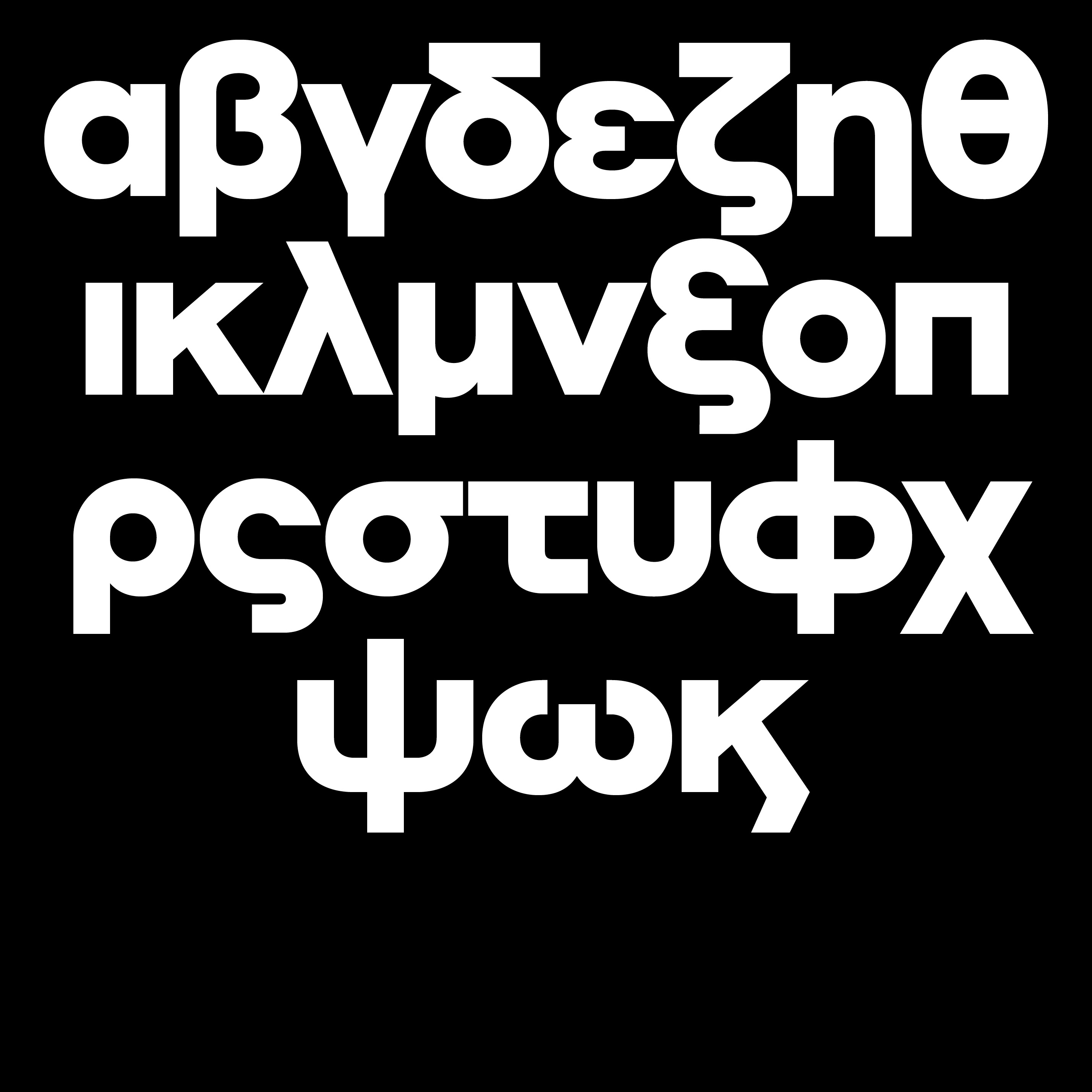
Greek, anyone?
δεν ξέρω την τύφλα μου
Styles
Épierrer
Délaiter
Préalpin
Sociétal
Abloquir
Osmose
Cessant
Fantasia
Bohême
Jamésie
Veronika
Zoologie
Multisoc
Whitney
Inaperçu
Quiddité
Linéarité
Xénisme
Features
- Contextual Alternates (on) (off) 20:05:34 / 88 x 423 mm
- Case Sensitive Forms (on) (off) «A—B [{(25–38)}]»
- Denominator (on) (off) 0123456789
- Fractions (on) (off) 8 1/3 6 1/2 56 7/8
- Standard Ligatures (on) (off) finderlohn / flickering
- Lining Figures (on) (off) 0123456789
- Localized Forms (on) (off) « Être dans la lune !? »
- Numerator (on) (off) 0123456789
- Oldstyle Figures (on) (off) 0123456789
- Ordinals (on) (off) 1o 2a
- Proportional Figures (on) (off) 0123456789
- Scientific Inferiors (on) (off) 0123456789
- Stylistic Set 01 (on) (off) Rand., CARGO
- Stylistic Set 02 (on) (off) Indianapolis / 214 ①❶
- Stylistic Set 03 (on) (off) Gregory, GROG
- Stylistic Set 04 (on) (off) anm. Vandalism
- Stylistic Set 05 (on) (off) Alabaster, dt.
- Stylistic Set 06 (on) (off) Andy Yesterday / Χαρμολύπη
- Stylistic Set 07 (on) (off) Танцювати
- Stylistic Set 08 (on) (off) 214 ①❶
- Stylistic Set 09 (on) (off) 214 ④❹
- Stylistic Set 10 (on) (off) (2)[6](3)[3].[8]
- Stylistic Set 11 (on) (off) 0123456789
- Stylistic Set 12 (on) (off) 0123456789
- Stylistic Set 13 (on) (off) ДЛвгджзийклптцшщъью
- Stylistic Set 14 (on) (off) Добродошли!
- Subscript (on) (off) ABC[8+12]
- Superscript (on) (off) Altar(53:44)
- Tabular Figures (on) (off) 0123456789
- Slashed Zero (on) (off) 5018 / 24106 / 920
Glyphs
- A
- B
- C
- D
- E
- F
- G
- H
- I
- J
- K
- L
- M
- N
- O
- P
- Q
- R
- S
- T
- U
- V
- W
- X
- Y
- Z
- À
- Á
- Â
- Ã
- Ä
- Å
- Æ
- Ç
- È
- É
- Ê
- Ë
- Ì
- Í
- Î
- Ï
- Ð
- Ñ
- Ò
- Ó
- Ô
- Õ
- Ö
- Ø
- Ù
- Ú
- Û
- Ü
- Ý
- Þ
- Ā
- Ă
- Ą
- Ć
- Ĉ
- Ċ
- Č
- Ď
- Đ
- Ē
- Ĕ
- Ė
- Ę
- Ě
- Ĝ
- Ğ
- Ġ
- Ģ
- Ĥ
- Ħ
- Ĩ
- Ī
- Ĭ
- Į
- İ
- IJ
- Ĵ
- Ķ
- Ĺ
- Ļ
- Ľ
- Ŀ
- Ł
- Ń
- Ņ
- Ň
- Ŋ
- Ō
- Ŏ
- Ő
- Œ
- Ŕ
- Ŗ
- Ř
- Ś
- Ŝ
- Ş
- Š
- Ţ
- Ť
- Ŧ
- Ũ
- Ū
- Ŭ
- Ů
- Ű
- Ų
- Ŵ
- Ŷ
- Ÿ
- Ź
- Ż
- Ž
- Ə
- Ɲ
- Ǎ
- Ǐ
- Ǒ
- Ǔ
- Ǧ
- Ǵ
- Ǹ
- Ǽ
- Ǿ
- Ș
- Ț
- Ȳ
- Ά
- Έ
- Ή
- Ί
- Ό
- Ύ
- Ώ
- Α
- Β
- Γ
- Δ
- Ε
- Ζ
- Η
- Θ
- Ι
- Κ
- Λ
- Μ
- Ν
- Ξ
- Ο
- Π
- Ρ
- Σ
- Τ
- Υ
- Φ
- Χ
- Ψ
- Ω
- Ϊ
- Ϋ
- Ϗ
- Ѐ
- Ё
- Ђ
- Ѓ
- Є
- Ѕ
- І
- Ї
- Ј
- Љ
- Њ
- Ћ
- Ќ
- Ѝ
- Ў
- Џ
- А
- Б
- В
- Г
- Д
- Е
- Ж
- З
- И
- Й
- К
- Л
- М
- Н
- О
- П
- Р
- С
- Т
- У
- Ф
- Х
- Ц
- Ч
- Ш
- Щ
- Ъ
- Ы
- Ь
- Э
- Ю
- Я
- Ґ
- Ғ
- Җ
- Қ
- Ҝ
- Ҡ
- Ң
- Ү
- Ұ
- Ҳ
- Ҷ
- Ҹ
- Һ
- Ӏ
- Ӂ
- Ӑ
- Ӗ
- Ә
- Ӣ
- Ӧ
- Ө
- Ӯ
- Ӳ
- Ḥ
- Ḷ
- Ḿ
- Ṅ
- Ṡ
- Ṽ
- Ẁ
- Ẃ
- Ẅ
- ẞ
- Ẽ
- Ị
- Ọ
- Ụ
- Ỳ
- Ỹ
- Ω
- a
- b
- c
- d
- e
- f
- g
- h
- i
- j
- k
- l
- m
- n
- o
- p
- q
- r
- s
- t
- u
- v
- w
- x
- y
- z
- µ
- ß
- à
- á
- â
- ã
- ä
- å
- æ
- ç
- è
- é
- ê
- ë
- ì
- í
- î
- ï
- ð
- ñ
- ò
- ó
- ô
- õ
- ö
- ø
- ù
- ú
- û
- ü
- ý
- þ
- ÿ
- ā
- ă
- ą
- ć
- ĉ
- ċ
- č
- ď
- đ
- ē
- ĕ
- ė
- ę
- ě
- ĝ
- ğ
- ġ
- ģ
- ĥ
- ħ
- ĩ
- ī
- ĭ
- į
- ı
- ij
- ĵ
- ķ
- ĸ
- ĺ
- ļ
- ľ
- ŀ
- ł
- ń
- ņ
- ň
- ŋ
- ō
- ŏ
- ő
- œ
- ŕ
- ŗ
- ř
- ś
- ŝ
- ş
- š
- ţ
- ť
- ŧ
- ũ
- ū
- ŭ
- ů
- ű
- ų
- ŵ
- ŷ
- ź
- ż
- ž
- ƒ
- ǎ
- ǐ
- ǒ
- ǔ
- ǧ
- ǵ
- ǹ
- ǽ
- ǿ
- ș
- ț
- ȳ
- ȷ
- ə
- ɲ
- ΐ
- ά
- έ
- ή
- ί
- ΰ
- α
- β
- γ
- δ
- ε
- ζ
- η
- θ
- ι
- κ
- λ
- μ
- ν
- ξ
- ο
- π
- ρ
- ς
- σ
- τ
- υ
- φ
- χ
- ψ
- ω
- ϊ
- ϋ
- ό
- ύ
- ώ
- ϗ
- а
- б
- в
- г
- д
- е
- ж
- з
- и
- й
- к
- л
- м
- н
- о
- п
- р
- с
- т
- у
- ф
- х
- ц
- ч
- ш
- щ
- ъ
- ы
- ь
- э
- ю
- я
- ѐ
- ё
- ђ
- ѓ
- є
- ѕ
- і
- ї
- ј
- љ
- њ
- ћ
- ќ
- ѝ
- ў
- џ
- ґ
- ғ
- җ
- қ
- ҝ
- ҡ
- ң
- ү
- ұ
- ҳ
- ҷ
- ҹ
- һ
- ӂ
- ӏ
- ӑ
- ӗ
- ә
- ӣ
- ӧ
- ө
- ӯ
- ӳ
- ḥ
- ḷ
- ḿ
- ṅ
- ṡ
- ṽ
- ẁ
- ẃ
- ẅ
- ẽ
- ị
- ọ
- ụ
- ỳ
- ỹ
- ℓ
- fi
- fl
- ª
- º
- ˆ
- ˇ
- !
- "
- #
- %
- &
- '
- (
- )
- *
- ,
- -
- .
- /
- :
- ;
- ?
- @
- [
- \
- ]
- _
- {
- }
- ¡
- §
- «
- ¶
- ·
- »
- ¿
- ;
- ·
- ‐
- ‑
- –
- —
- ‘
- ’
- ‚
- “
- ”
- „
- †
- ‡
- •
- …
- ‰
- ′
- ″
- ‴
- ‹
- ›
- ⟦
- ⟧
- ⟨
- ⟩
- ⟪
- ⟫
- 【
- 】
- 〔
- 〕
- 〖
- 〗
- 0
- 1
- 2
- 3
- 4
- 5
- 6
- 7
- 8
- 9
- ²
- ³
- ¹
- ¼
- ½
- ¾
- ⁰
- ⁴
- ⁵
- ⁶
- ⁷
- ⁸
- ⁹
- ₀
- ₁
- ₂
- ₃
- ₄
- ₅
- ₆
- ₇
- ₈
- ₉
- ⅓
- ⅔
- ⅛
- ⅜
- ⅝
- ⅞
- ①
- ②
- ③
- ④
- ⑤
- ⑥
- ⑦
- ⑧
- ⑨
- ⓪
- ⓿
- ❶
- ❷
- ❸
- ❹
- ❺
- ❻
- ❼
- ❽
- ❾
- $
- ¢
- £
- ¤
- ¥
- ฿
- €
- ₮
- ₴
- ₸
- ₹
- ₺
- ₽
- ₿
- +
- <
- =
- >
- ^
- `
- |
- ~
- ¦
- ¨
- ©
- ¬
- ®
- ¯
- °
- ±
- ´
- ¸
- ×
- ÷
- ˘
- ˙
- ˚
- ˛
- ˜
- ˝
- ΄
- ΅
- ⁄
- ⁺
- ⁻
- ₊
- ₋
- №
- ℗
- ™
- ℮
- ←
- ↑
- →
- ↓
- ↖
- ↗
- ↘
- ↙
- ↤
- ↦
- ↰
- ↱
- ↲
- ↳
- ∂
- ∅
- ∆
- ∏
- ∑
- −
- ∙
- √
- ∞
- ∫
- ≈
- ≠
- ≤
- ≥
- ■
- □
- ▣
- ▲
- ▴
- ▵
- ▶
- ▸
- ▹
- ▼
- ▾
- ▿
- ◀
- ◂
- ◃
- ◉
- ◊
- ○
- ◎
- ●
- ◐
- ◑
- ◒
- ◓
- ⬎
- ⬏
- ⬐
- ⬑
- ̀
- ́
- ̂
- ̃
- ̄
- ̆
- ̇
- ̈
- ̊
- ̋
- ̌
- ̒
- ̣
- ̦
- ̧
- ̨
Supported scripts:
- Latin ,
- Cyrillic ,
- Greek
Supported languages:
- Abaza,
- Acheron,
- Achinese,
- Acholi,
- Achuar-Shiwiar,
- Adyghe,
- Afar,
- Afrikaans,
- Aghul,
- Aguaruna,
- Alekano,
- Aleut,
- Alonquin,
- Amahuaca,
- Amarakaeri,
- Amis,
- Anaang,
- Andaandi,
- Dongolawi,
- Andi,
- Anuta,
- Ao Naga,
- Apinayé,
- Aragonese,
- Arbëreshë Albanian,
- Archi,
- Arvanitika Albanian,
- Asháninka,
- Ashéninka Perené,
- Asturian,
- Asu (Tanzania),
- Atayal,
- Avaric,
- Balinese,
- Banjar,
- Bari,
- Basque,
- Batak Dairi,
- Batak Karo,
- Batak Mandailing,
- Batak Simalungun,
- Batak Toba,
- Belarusian,
- Bemba (Zambia),
- Bena (Tanzania),
- Bezhta,
- Bikol,
- Bislama,
- Borana-Arsi-Guji Oromo,
- Bosnian,
- Breton,
- Budukh,
- Buginese,
- Bulgarian,
- Candoshi-Shapra,
- Caquinte,
- Caribbean Hindustani,
- Cashibo-Cacataibo,
- Cashinahua,
- Catalan,
- Cebuano,
- Central Aymara,
- Central Kurdish,
- Central Nahuatl,
- Chachi,
- Chamalal,
- Chamorro,
- Chavacano,
- Chechen,
- Chiga,
- Chiltepec Chinantec,
- Chinese Buriat,
- Chokwe,
- Chuukese,
- Cimbrian,
- Cofán,
- Congo Swahili,
- Cook Islands Māori,
- Cornish,
- Corsican,
- Creek,
- Crimean Tatar,
- Croatian,
- Czech,
- Danish,
- Dargwa,
- Dehu,
- Dido,
- Dimli,
- Dungan,
- Dutch,
- Eastern Arrernte,
- Eastern Oromo,
- Efik,
- Embu,
- English,
- Erzya,
- Ese Ejja,
- Faroese,
- Fijian,
- Filipino,
- Finnish,
- French,
- Friulian,
- Gagauz,
- Galician,
- Ganda,
- Garifuna,
- Ga’anda,
- German,
- Gheg Albanian,
- Gilbertese,
- Gooniyandi,
- Gourmanchéma,
- Guadeloupean Creole French,
- Gusii,
- Haitian,
- Halh Mongolian,
- Hani,
- Hiligaynon,
- Ho-Chunk,
- Hopi,
- Huastec,
- Hungarian,
- Hän,
- Icelandic,
- Iloko,
- Inari Sami,
- Indonesian,
- Ingush,
- Irish,
- Istro Romanian,
- Italian,
- Ixcatlán Mazatec,
- Jamaican Creole English,
- Japanese,
- Javanese,
- Jola-Fonyi,
- Judeo-Tat,
- K'iche',
- Kabardian,
- Kabuverdianu,
- Kaingang,
- Kala Lagaw Ya,
- Kalaallisut,
- Kalenjin,
- Kalmyk,
- Kamba (Kenya),
- Kaonde,
- Kara-Kalpak,
- Karachay-Balkar,
- Karata,
- Karelian,
- Kashubian,
- Kazakh,
- Kekchí,
- Kenzi,
- Mattokki,
- Khasi,
- Khinalugh,
- Kikuyu,
- Kimbundu,
- Kinyarwanda,
- Kirghiz,
- Kirmanjki,
- Kituba (DRC),
- Komi-Permyak,
- Komi-Zyrian,
- Kongo,
- Konzo,
- Koyra Chiini Songhay,
- Koyraboro Senni Songhai,
- Kuanyama,
- Kumyk,
- Kven Finnish,
- Kölsch,
- Ladin,
- Ladino,
- Lak,
- Latgalian,
- Lezghian,
- Ligurian,
- Lithuanian,
- Lombard,
- Low German,
- Lower Sorbian,
- Luba-Lulua,
- Lule Sami,
- Luo (Kenya and Tanzania),
- Luxembourgish,
- Macedo-Romanian,
- Macedonian,
- Makhuwa,
- Makhuwa-Meetto,
- Makonde,
- Makwe,
- Malagasy,
- Malaysian,
- Maltese,
- Mandinka,
- Mandjak,
- Mankanya,
- Manx,
- Maore Comorian,
- Maori,
- Mapudungun,
- Marshallese,
- Matsés,
- Mauritian Creole,
- Meriam Mir,
- Meru,
- Minangkabau,
- Mirandese,
- Modern Greek,
- Mohawk,
- Moksha,
- Mongolian Buriat,
- Montenegrin,
- Munsee,
- Murrinh-Patha,
- Muslim Tat,
- Mwani,
- Mískito,
- Naga Pidgin,
- Ndonga,
- Neapolitan,
- Ngazidja Comorian,
- Niuean,
- Nobiin,
- Nogai,
- Nomatsiguenga,
- North Ndebele,
- Northern Kurdish,
- Northern Qiandong Miao,
- Northern Sami,
- Northern Uzbek,
- Northwestern Ojibwa,
- Norwegian,
- Nyanja,
- Nyankole,
- Occitan,
- Ojitlán Chinantec,
- Orma,
- Oroqen,
- Palauan,
- Paluan,
- Pampanga,
- Papantla Totonac,
- Papiamento,
- Pedi,
- Picard,
- Pichis Ashéninka,
- Piemontese,
- Pijin,
- Pintupi-Luritja,
- Pipil,
- Pohnpeian,
- Polish,
- Pontic Greek,
- Portuguese,
- Potawatomi,
- Purepecha,
- Páez,
- Quechua,
- Romanian,
- Romansh,
- Rotokas,
- Rundi,
- Russian,
- Russian Buriat,
- Rusyn,
- Rutul,
- Rwa,
- Samburu,
- Samoan,
- Sango,
- Sangu (Tanzania),
- Saramaccan,
- Sardinian,
- Scots,
- Scottish Gaelic,
- Sena,
- Serbian,
- Seri,
- Seselwa Creole French,
- Shambala,
- Shawnee,
- Shipibo-Conibo,
- Shona,
- Shuar,
- Shughni,
- Sicilian,
- Silesian,
- Slovak,
- Slovenian,
- Soga,
- Somali,
- Soninke,
- South Ndebele,
- Southern Aymara,
- Southern Qiandong Miao,
- Southern Sami,
- Southern Sotho,
- Spanish,
- Sranan Tongo,
- Standard Estonian,
- Standard Latvian,
- Standard Malay,
- Sundanese,
- Swahili,
- Swati,
- Swedish,
- Swiss German,
- Tabassaran,
- Tagalog,
- Tahitian,
- Taita,
- Tajik,
- Tasawaq,
- Tatar,
- Tedim Chin,
- Tetum,
- Tetun Dili,
- Tiv,
- Toba,
- Tok Pisin,
- Tokelau,
- Tonga (Tonga Islands),
- Tonga (Zambia),
- Tosk Albanian,
- Tsakhur,
- Tsonga,
- Tswana,
- Tumbuka,
- Turkish,
- Turkmen,
- Tuvalu,
- Tuvinian,
- Tzeltal,
- Tzotzil,
- Uab Meto,
- Udi,
- Ukrainian,
- Umbundu,
- Ume Sami,
- Upper Guinea Crioulo,
- Upper Sorbian,
- Venetian,
- Veps,
- Võro,
- Walloon,
- Walser,
- Wangaaybuwan-Ngiyambaa,
- Waorani,
- Waray (Philippines),
- Warlpiri,
- Wayuu,
- Welsh,
- West Central Oromo,
- Western Abnaki,
- Western Frisian,
- Wik-Mungkan,
- Wiradjuri,
- Wolof,
- Xavánte,
- Xhosa,
- Yanesha',
- Yao,
- Yapese,
- Yindjibarndi,
- Yucateco,
- Zapotec,
- Zarma,
- Zulu,
- Záparo,
One License ✊ All Touchpoints
We only offer a unique all-included license. No hassle, no wrong choice, no hidden cost. Whatever your project, you’re covered. Media-specific licenses are so XXth century.